Brand & identity
Brand centre.
Official logos, colours, typography and practical guidance for representing Leigh FOB.
Brand system · Version 1.0
Strong enough to stand out.
Warm enough to welcome.
The crest carries the identity. Navy brings confidence, red creates focus and the voice keeps everything human and practical.
Primary identity
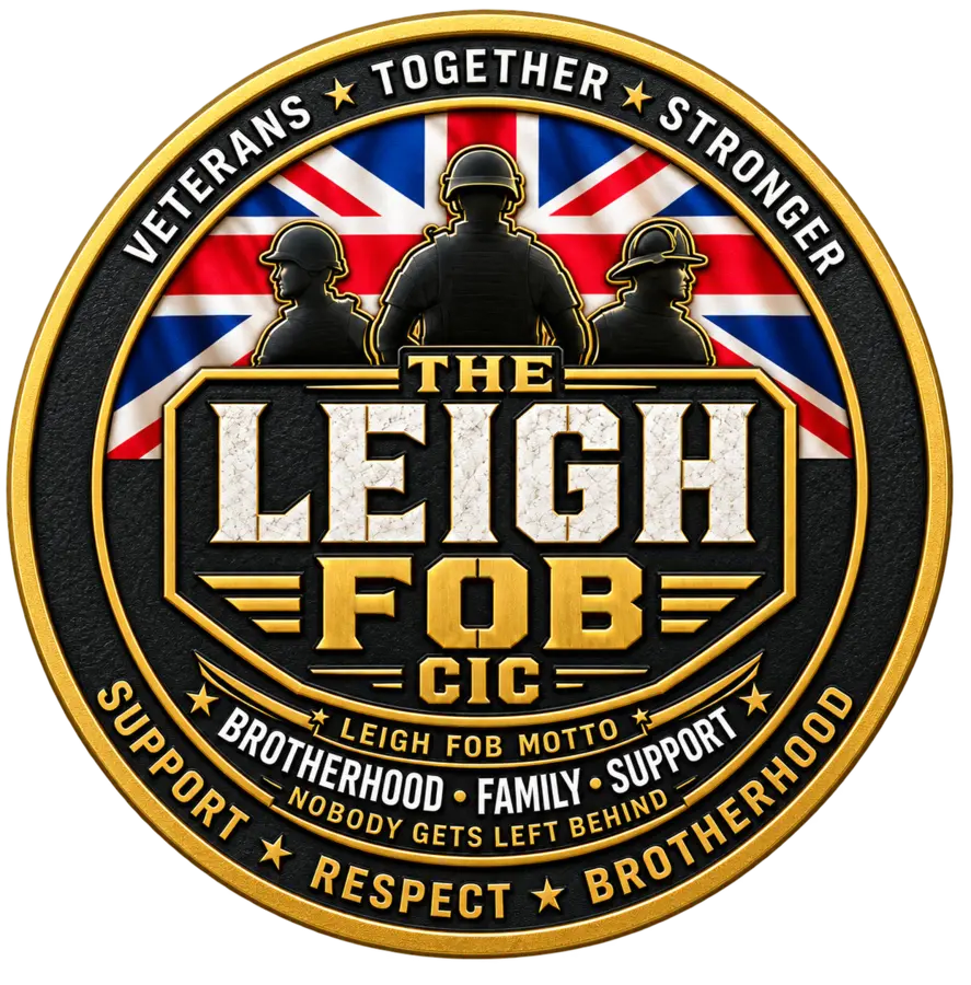
The Leigh FOB crest.
Use the supplied mark complete and unaltered. Its outer wording must remain legible, so do not use it below the minimum size.
Download the crest
Transparent PNGFull resolution · 1245 × 1263Download ↓Optimised WebPWebsite use · 887 × 900Download ↓
Minimum size120px digital · 30mm print
Clear spaceKeep at least one outer-ring width clear on every side.
Colour
A clear, confident palette.
Use navy and white as the foundation. Red is for action and emphasis. Coral is a sparing highlight, not a body-text colour.
The gold belongs inside the supplied crest artwork. Do not use it as the main colour for buttons, links or body text.
Typography
DM Sans.
One practical family for digital products, print and everyday documents. The lettering inside the crest is artwork and should not be imitated.
DM Sans Semibold · Headlines
A place to belong.
DM Sans Regular · Body
Write for people who want to understand something quickly. Use sentence case, short paragraphs and plain English.
Regular 400Medium 500Semibold 600Bold 700
Voice
Warm, direct and practical.
Sound like a capable person around the table: respectful, straightforward and never over-polished.
A warm welcome.
A clear next step.
A calm, steady presence.
Military theatre.
Corporate filler.
Claims we cannot evidence.
“Come for a brew. Stay for the company.”
Use it well
Four checks before publishing.
Current assets
Use the approved crest and the latest version of this guide.
Clear information
Check dates, contact details and support routes before publishing.
Real people
Use authentic community photography with permission and dignity.
Accurate claims
Only describe services and partnerships confirmed by the CIC.